How to produce creative for an independent food business – Fox Farm.
_____
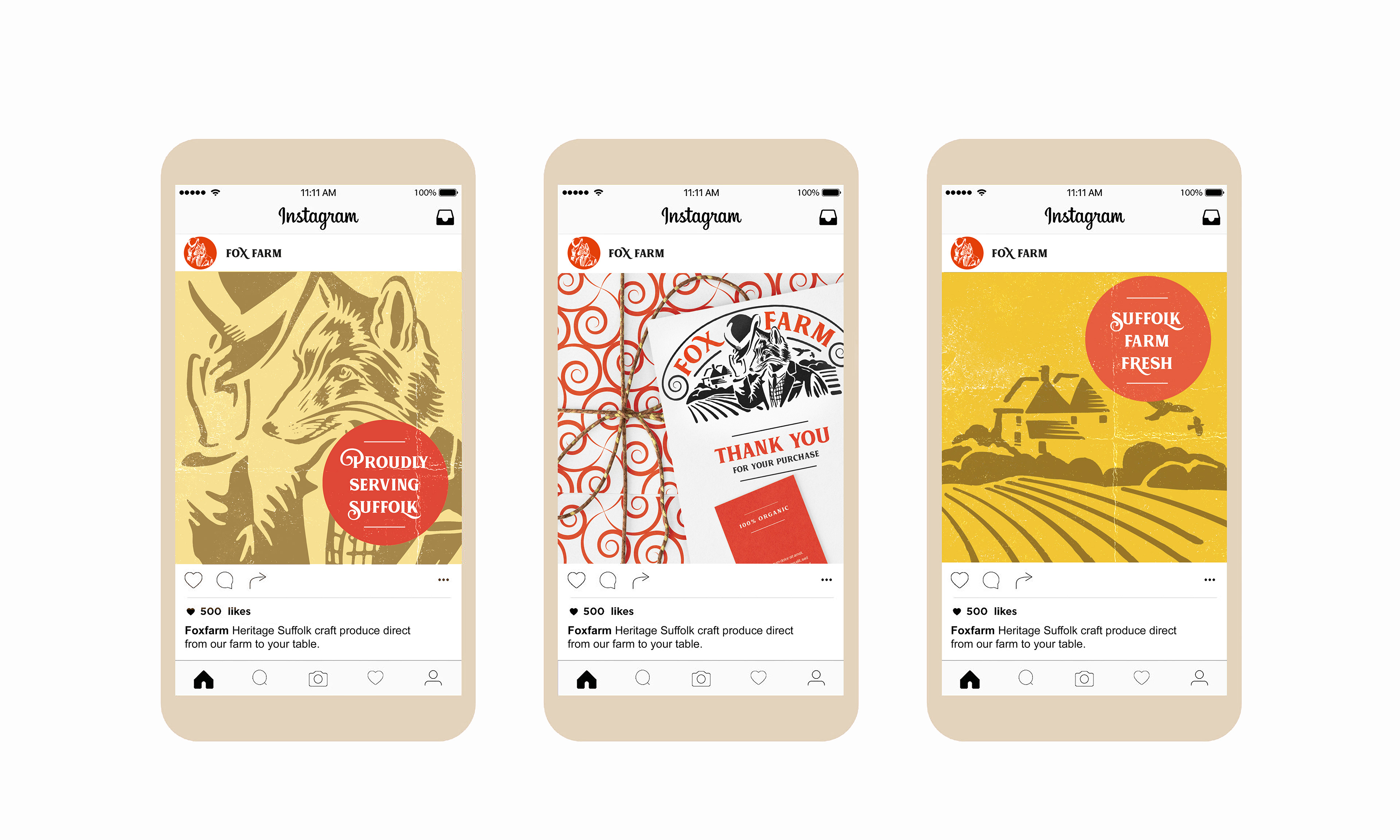
Here is an example of my process.
Background: Fox Farm is steeped in history and has been a farmstead since the early 19th century, the farmhouse dates from the 16th century and is located deep in the Suffolk countryside. The present owners carry on this tradition producing an exemplary range of organic farm grown and crafted products and wish to expand their sales to other farm shops and food retail outlets throughout East Anglia.
The brief: To create a logo and develop brand ideas for website, packaging and social media, using a traditional design style with a fresh modern look that's fun, friendly, clean and stand out.
Keywords: Fox, farm, organic, traditionally grown, fresh, wholesome, modern, fun, clean, stand out, Suffolk, countryside, farmhouse, history, farmstead, food, crafted, produce, English, polite, quirky.
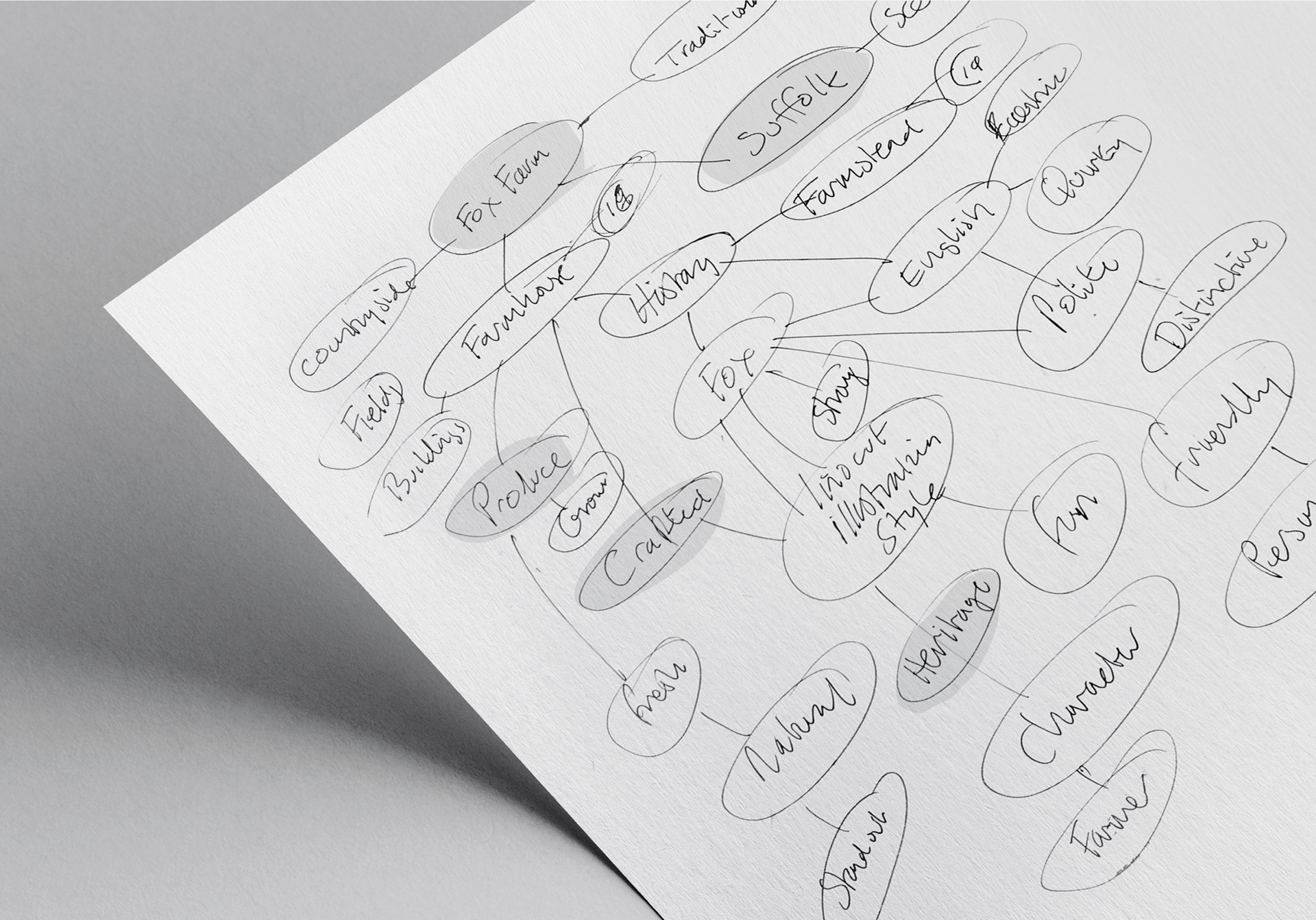
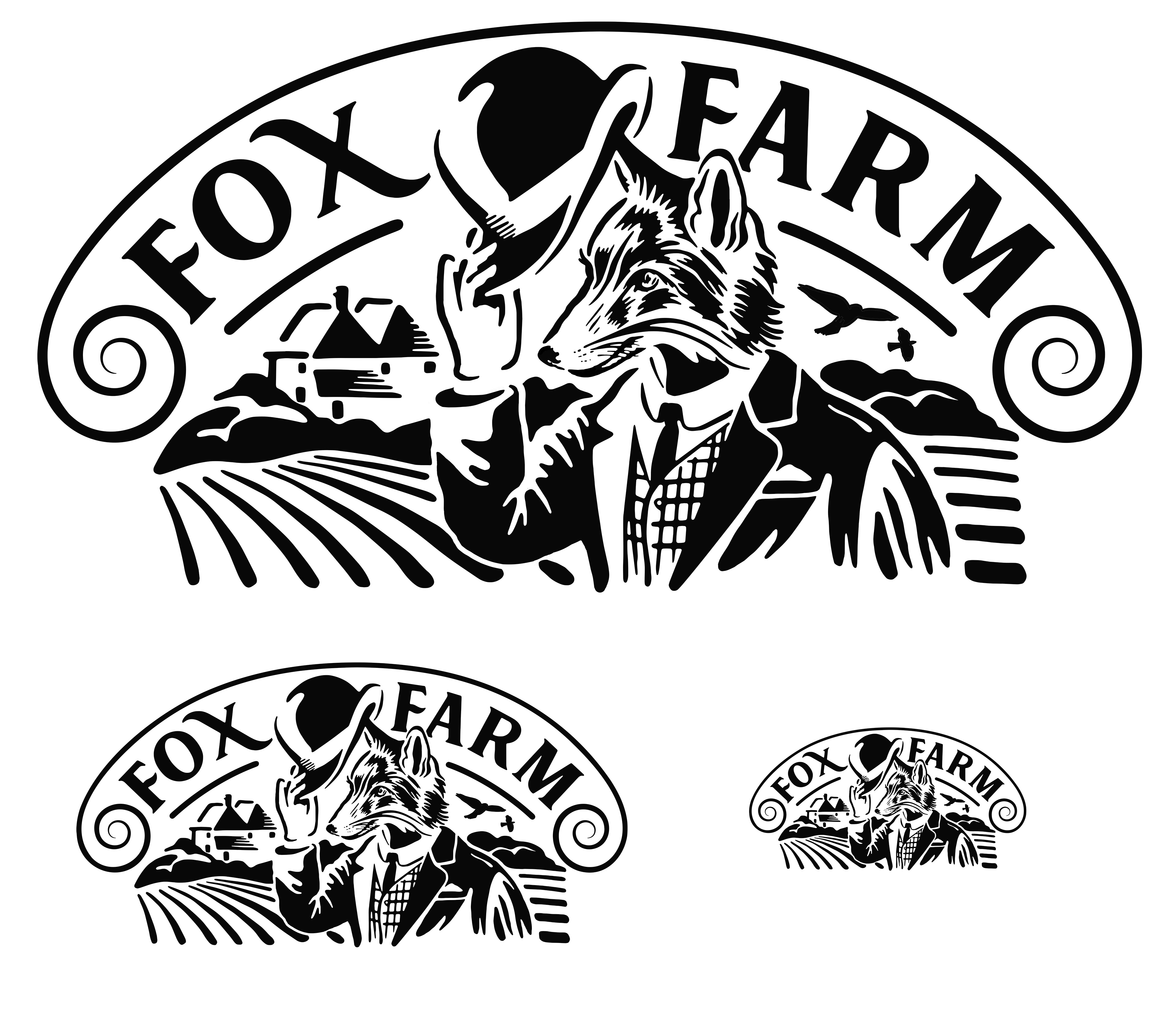
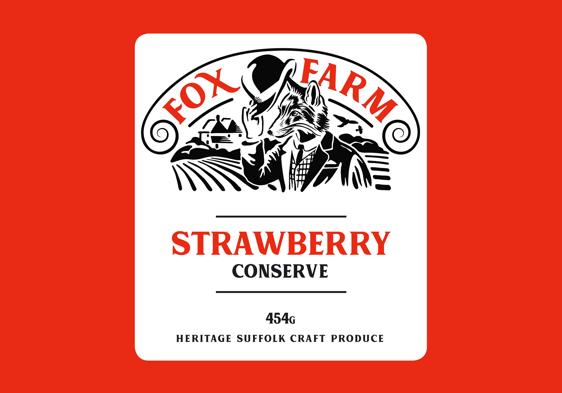
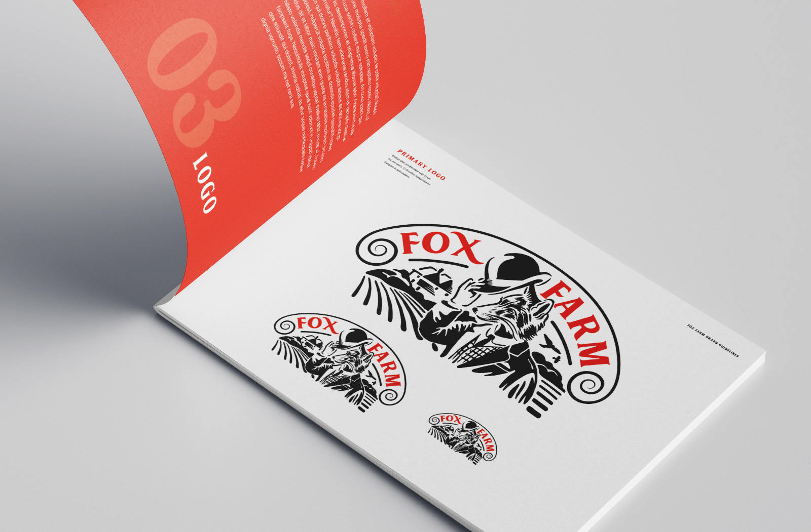
Word Mapping & Sketching ideas: Using keywords from the brief to form the strap-line Heritage Suffolk Craft Produce next started sketching fox ideas out on paper. First ideas looked too modern, I really needed to come up with something more traditional and I thought about creating a farmer fox character in the style of the Victorian and Edwardian Mr Fox. I then sourced a stock image of a vintage Mr Fox engraving that would be perfect to base the character on.
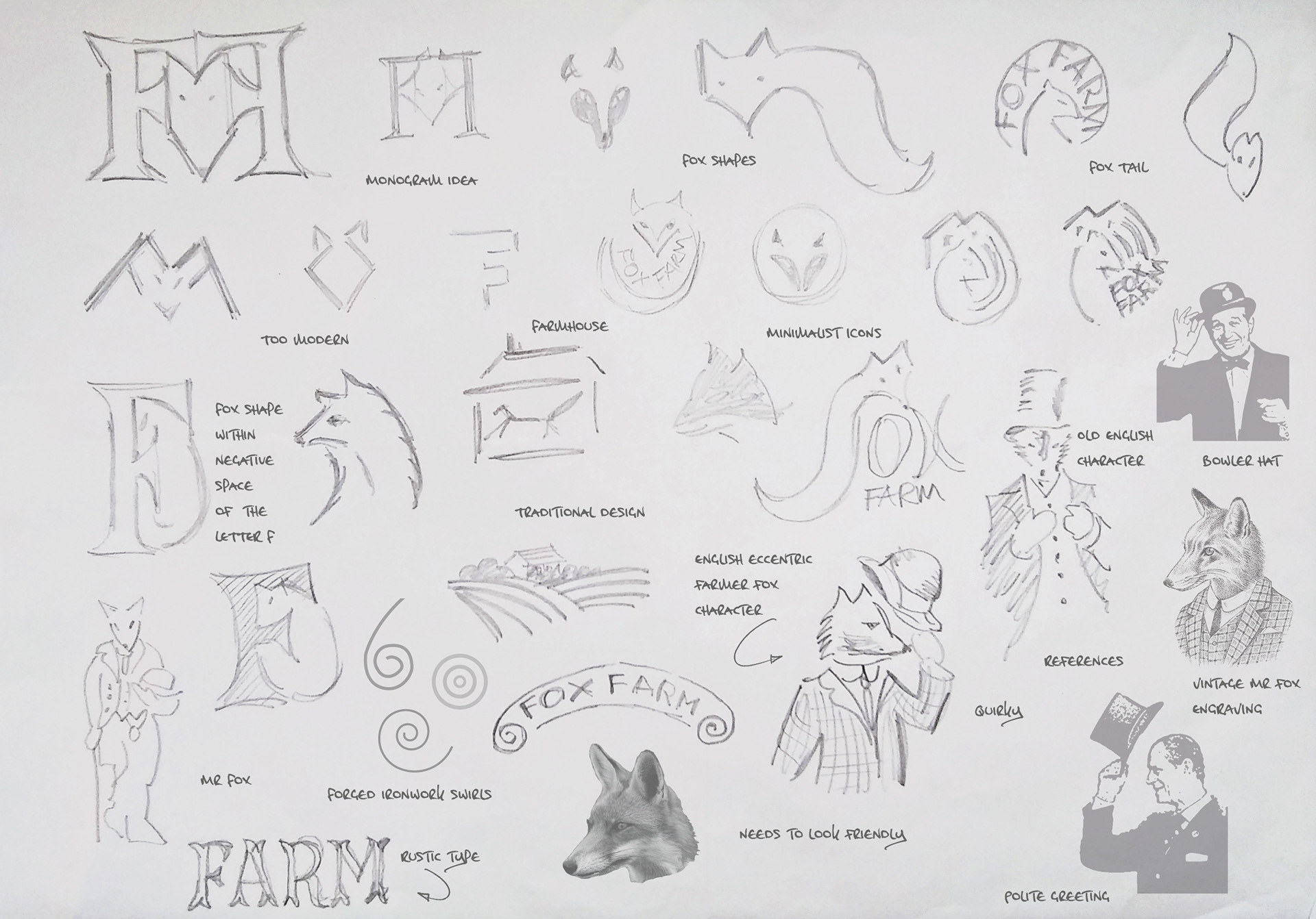
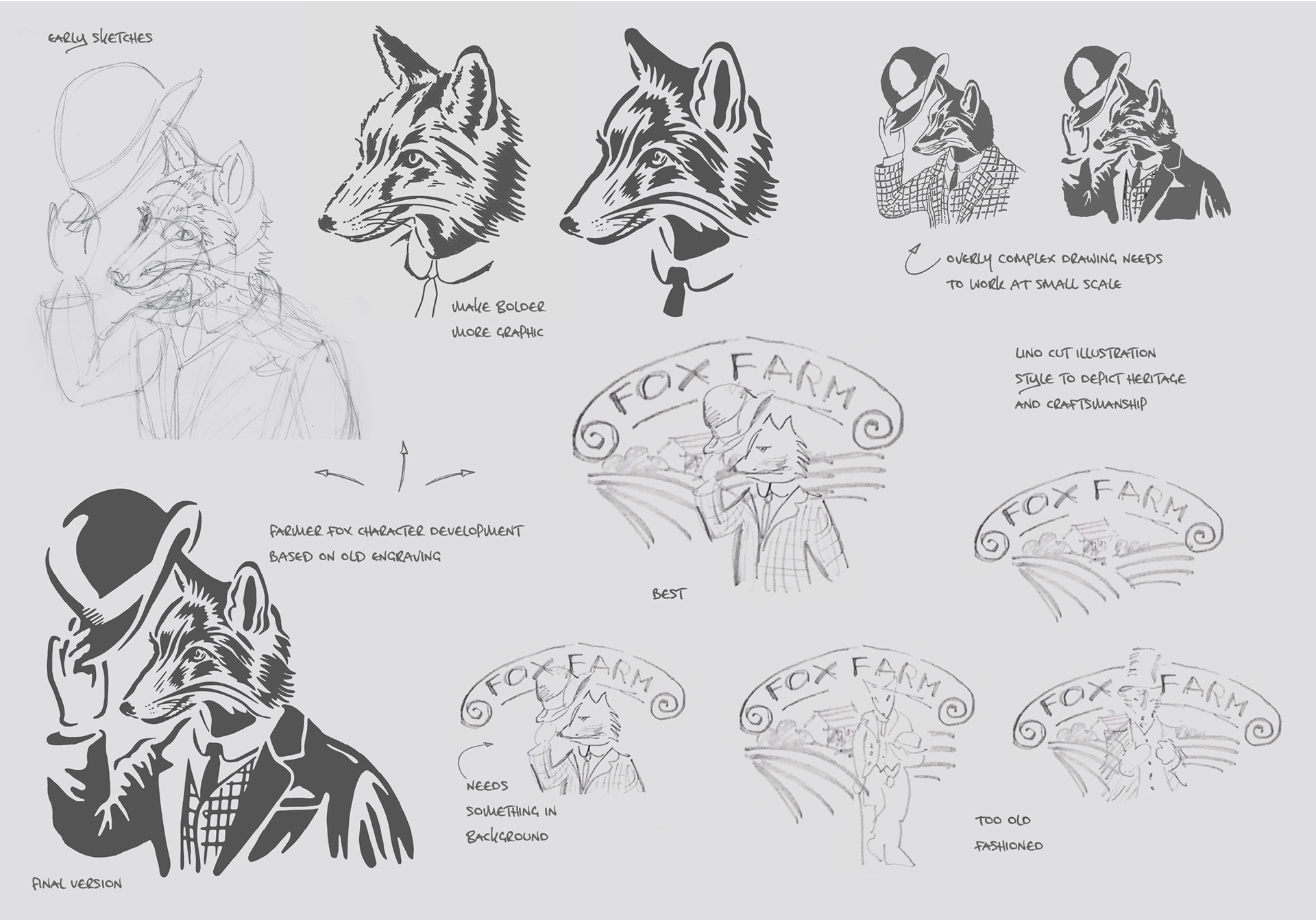
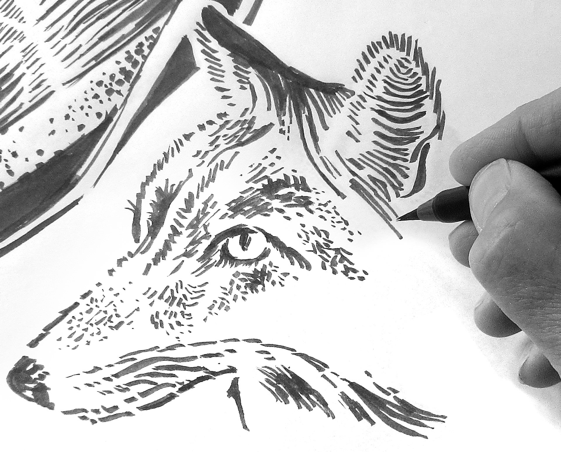
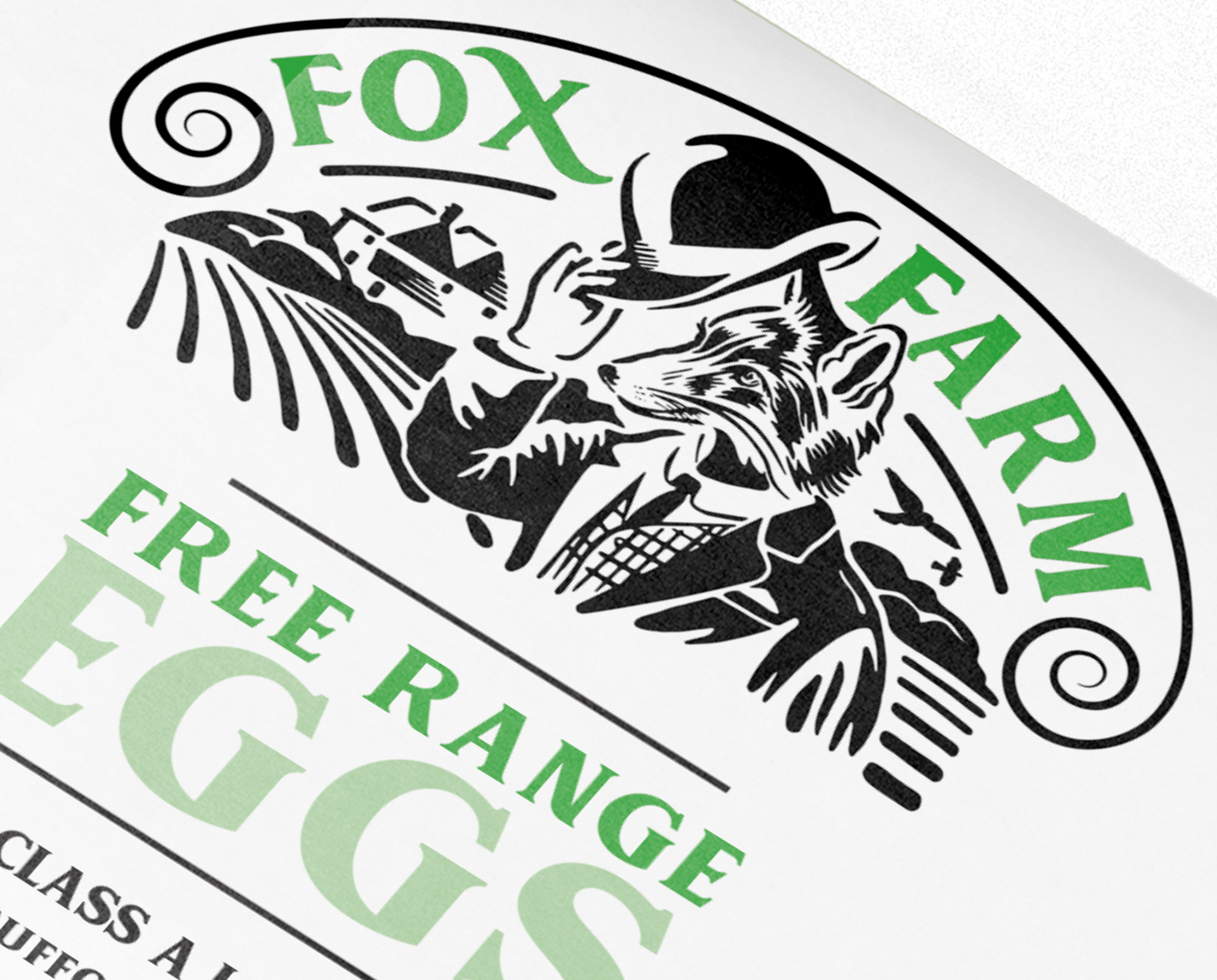
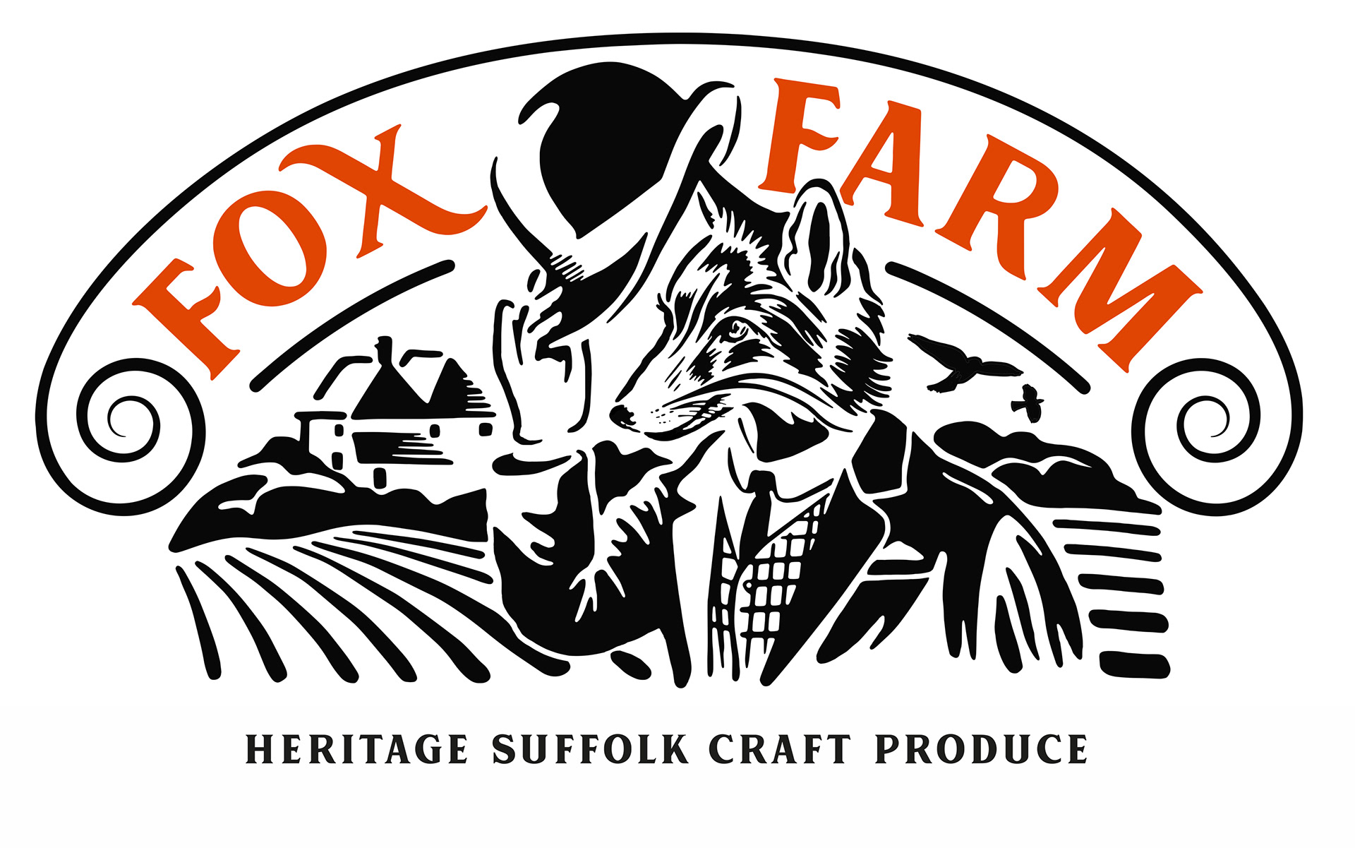
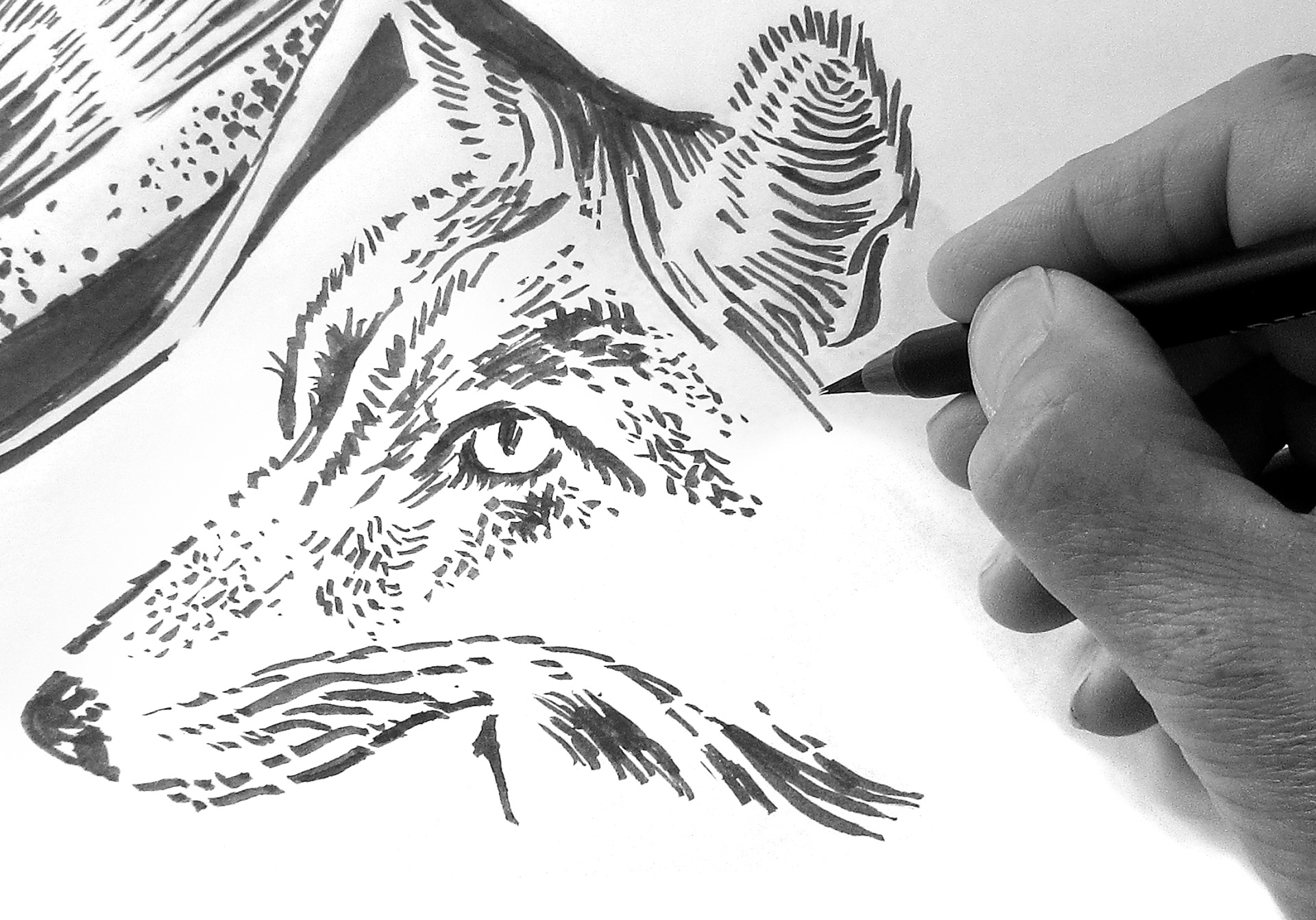
Character Illustration: The old engraving was far too detailed and needed to be re-drawn and simplified turning it into a logo that would be scalable. I also wanted to incorporate the fox tipping his hat in a friendly eccentric manner. After re-drawing and simplifying the character by hand I made a final vectorized version in illustrator using a digital pen and tablet.
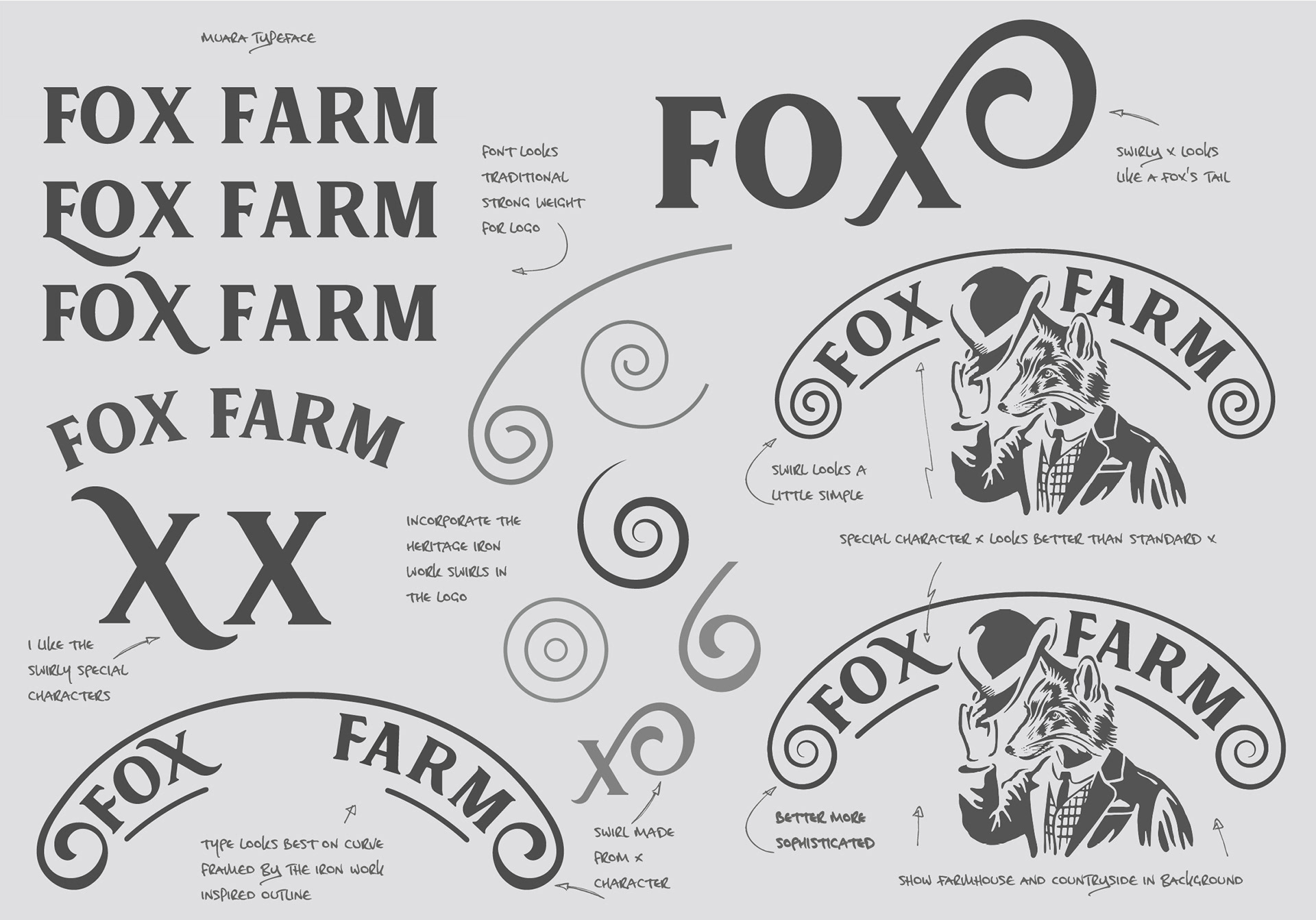
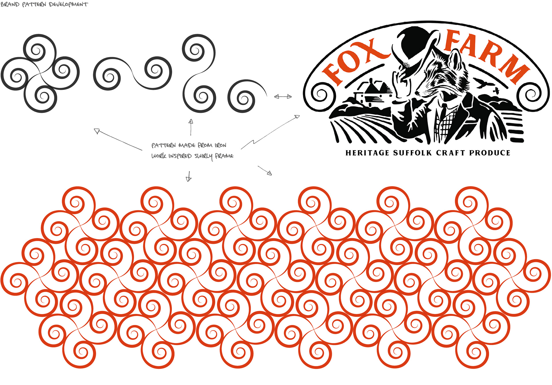
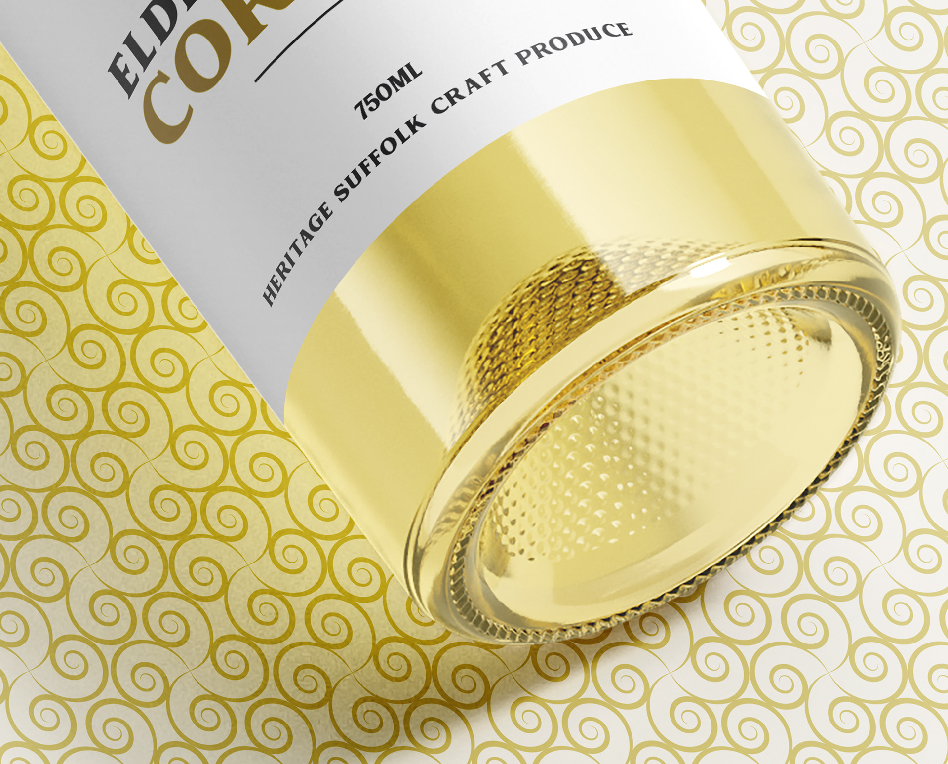
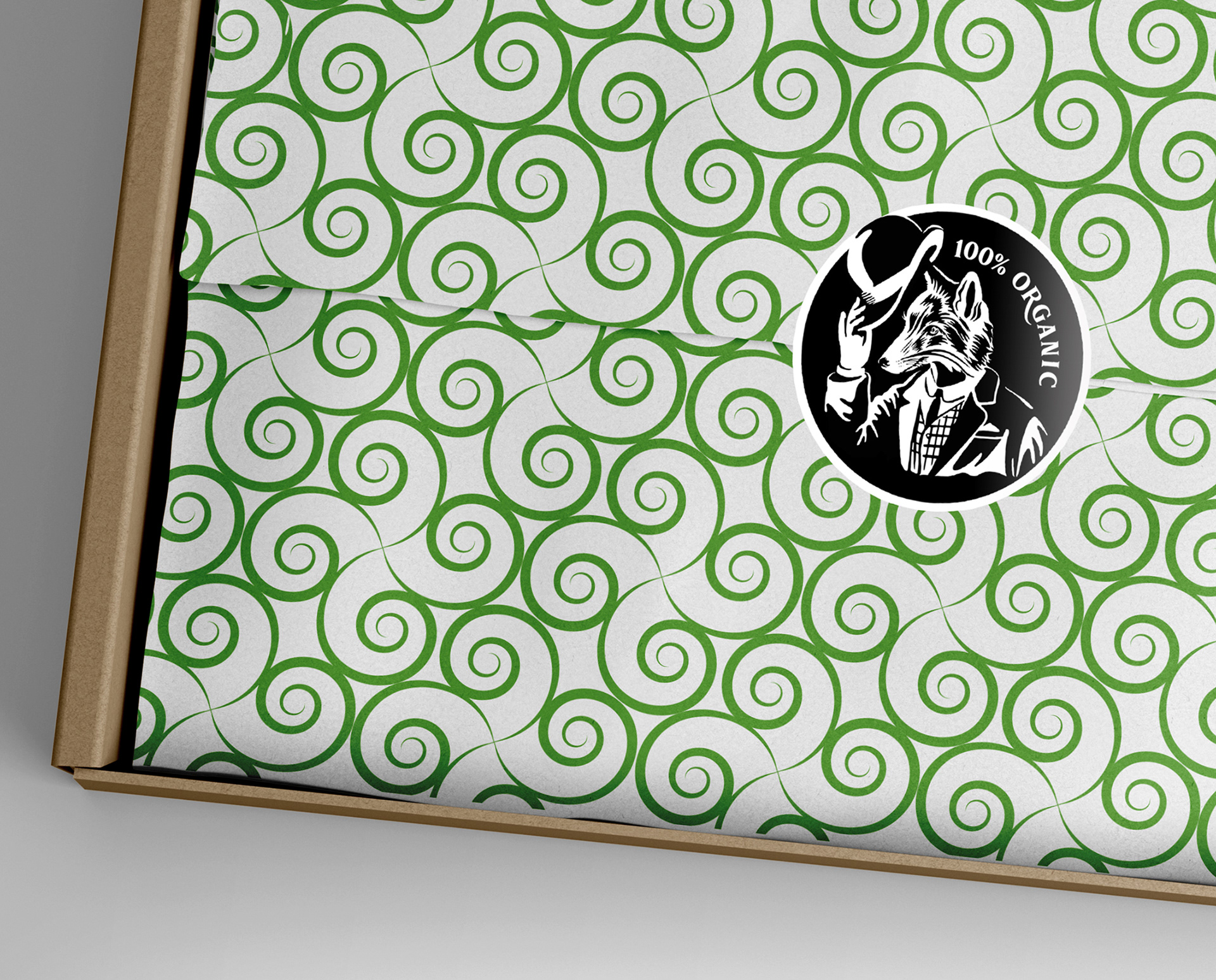
Typography: I chose the Muara typeface because it has a good solid weight, looks traditional in a contemporary way and suited the subject. The swirly flourishes are evocative of a fox tail and offer an opportunity to exploit further with brand typography and development.
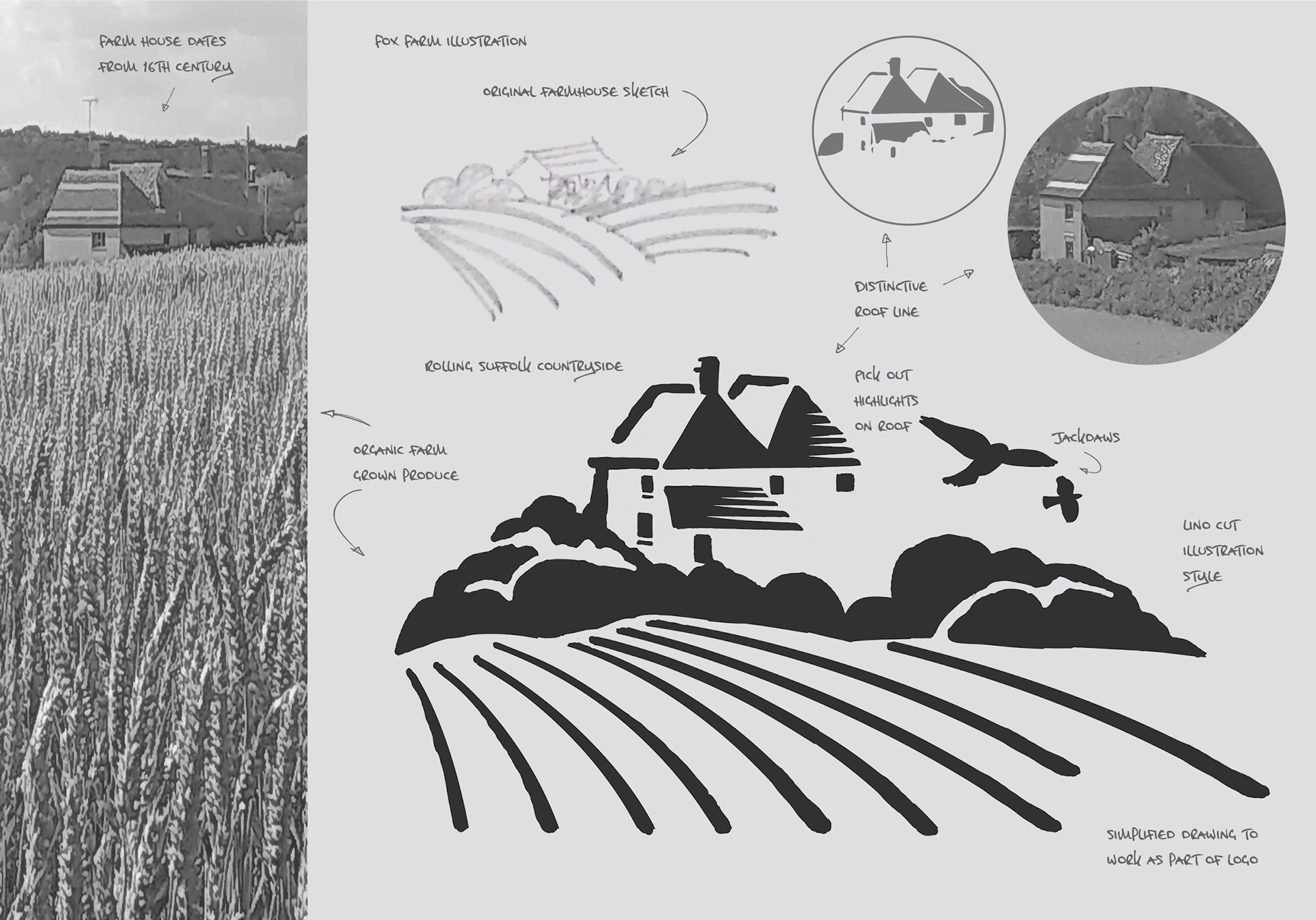
Farmhouse illustration: This was drawn from photo references showing the distinctive roof line, rolling countryside and Jackdaws in a lino cut illustrative style to work at small scale. The drawing was also vectorized in illustrator using a digital pen and tablet. All of the logo elements were assembled together creating the final logo design.

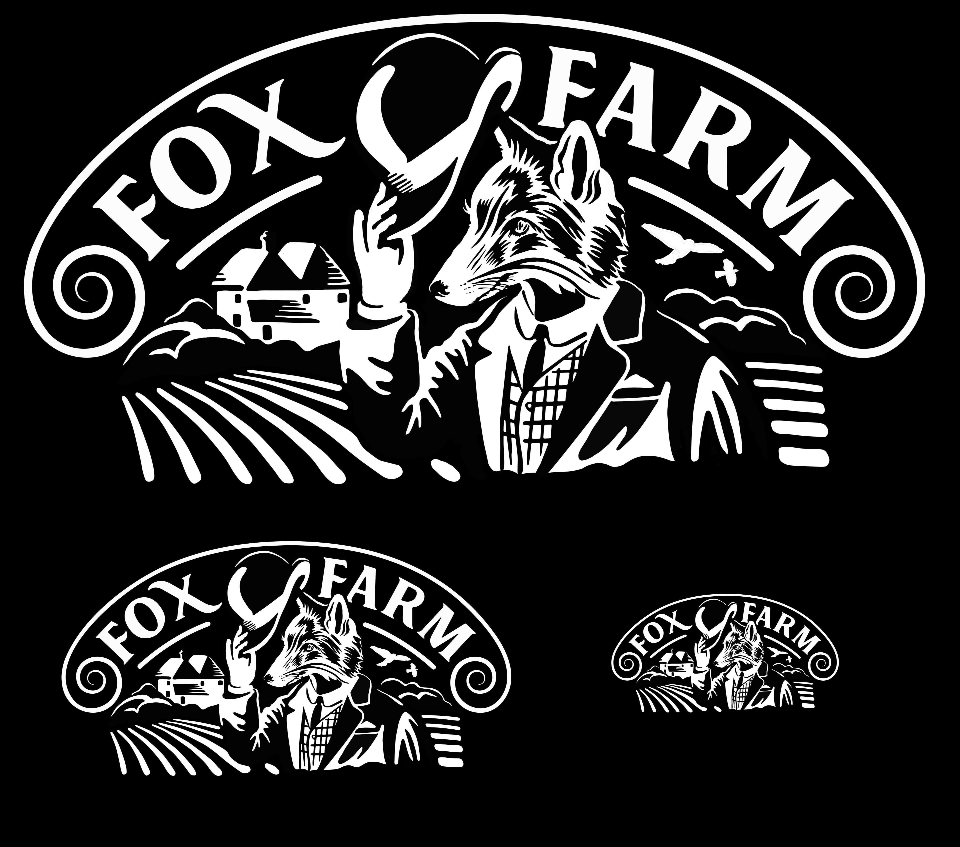
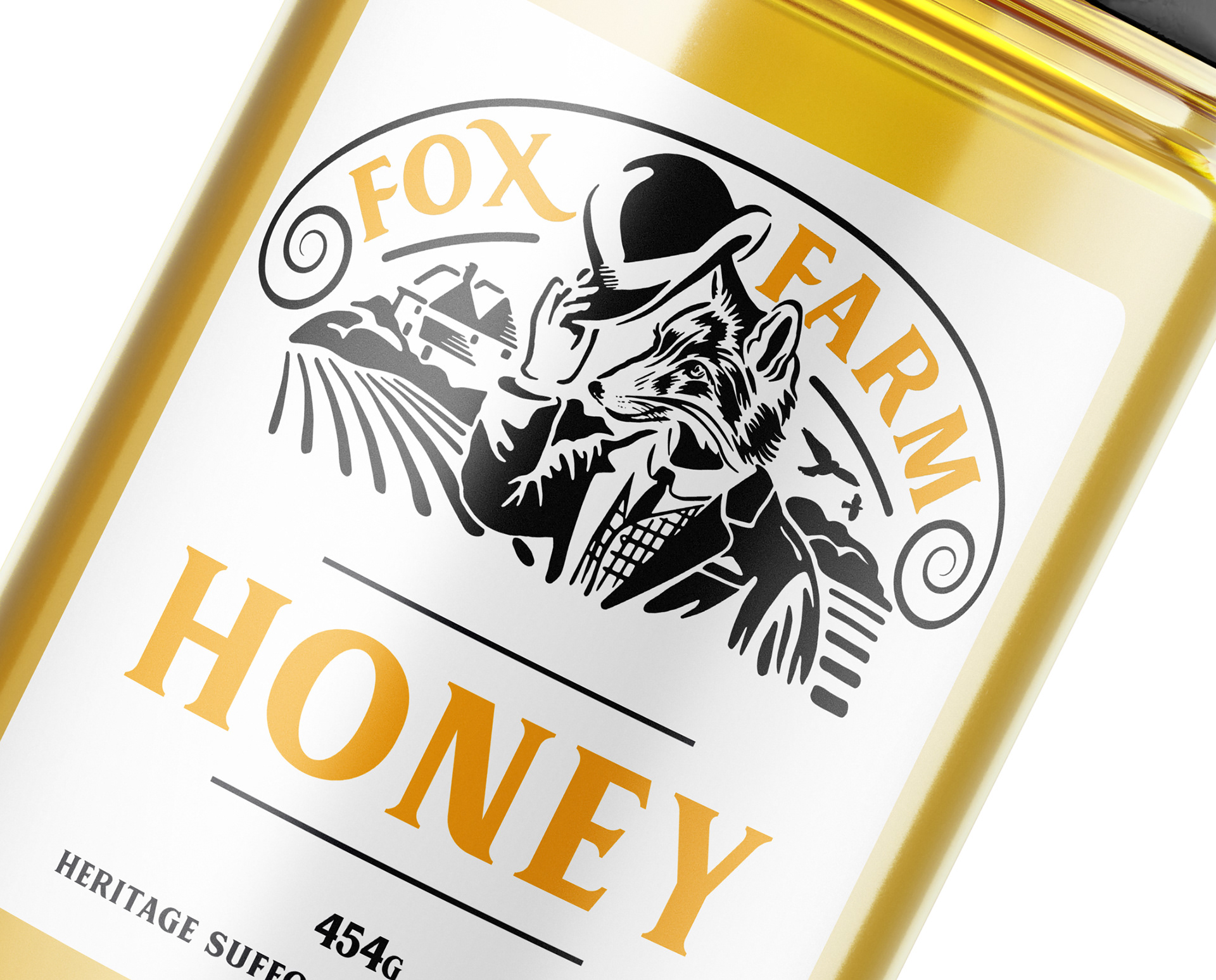
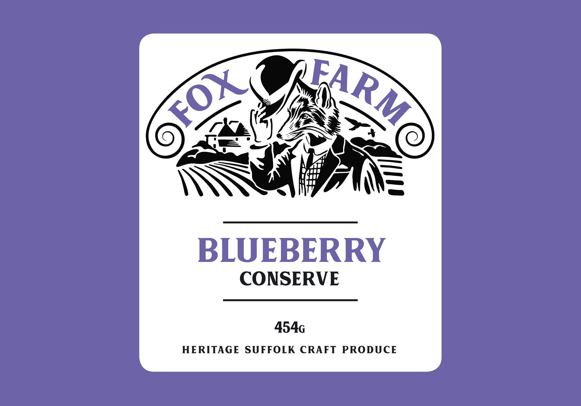
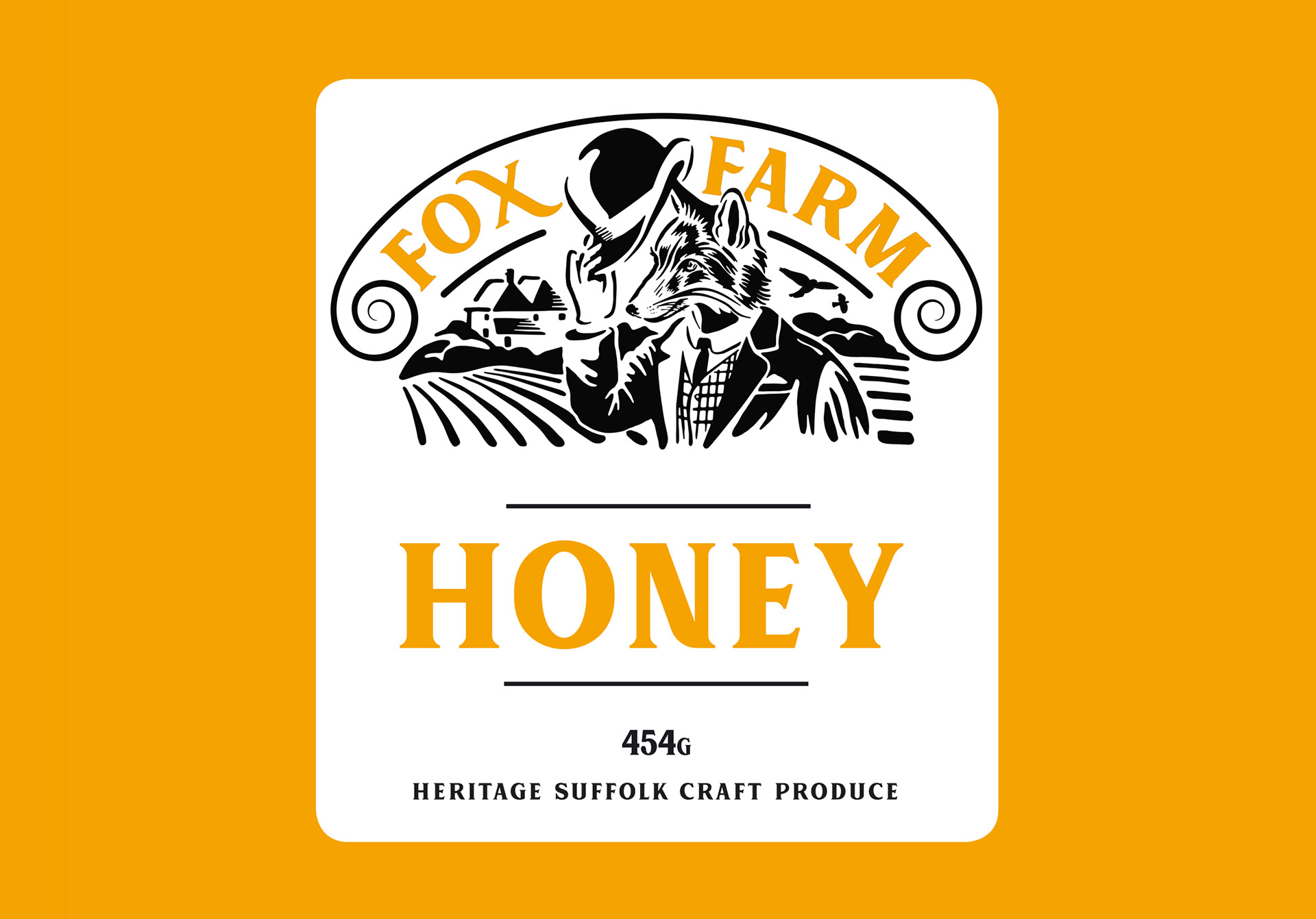
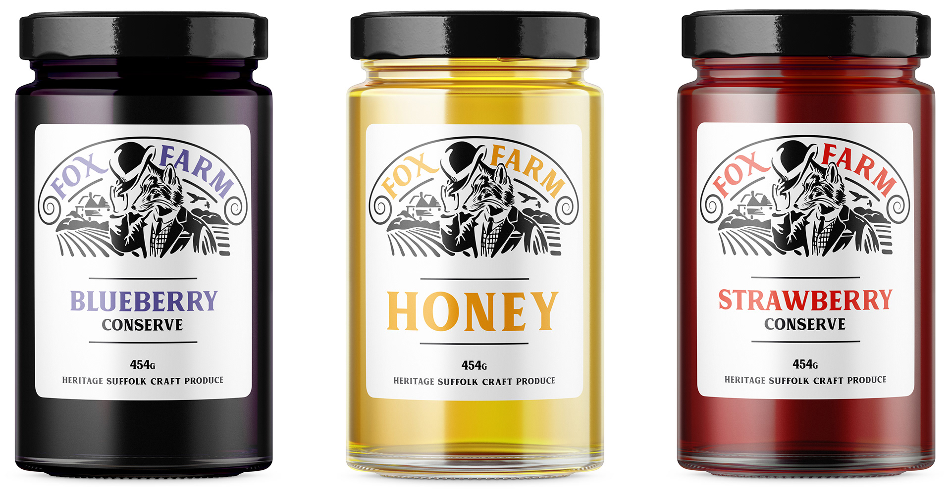
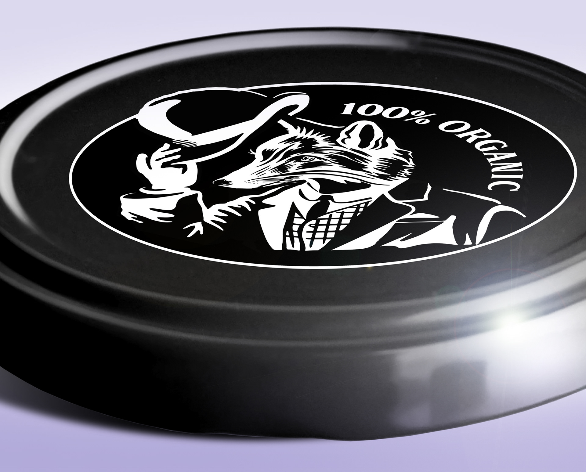
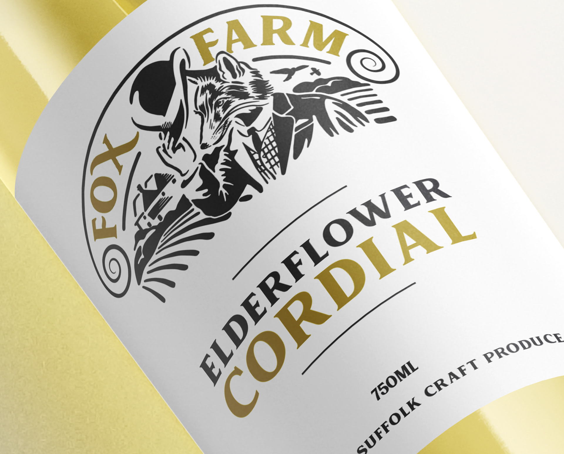
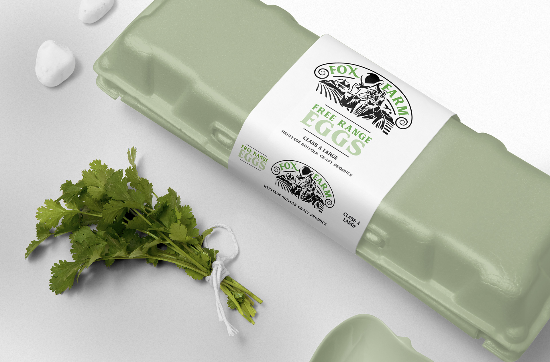
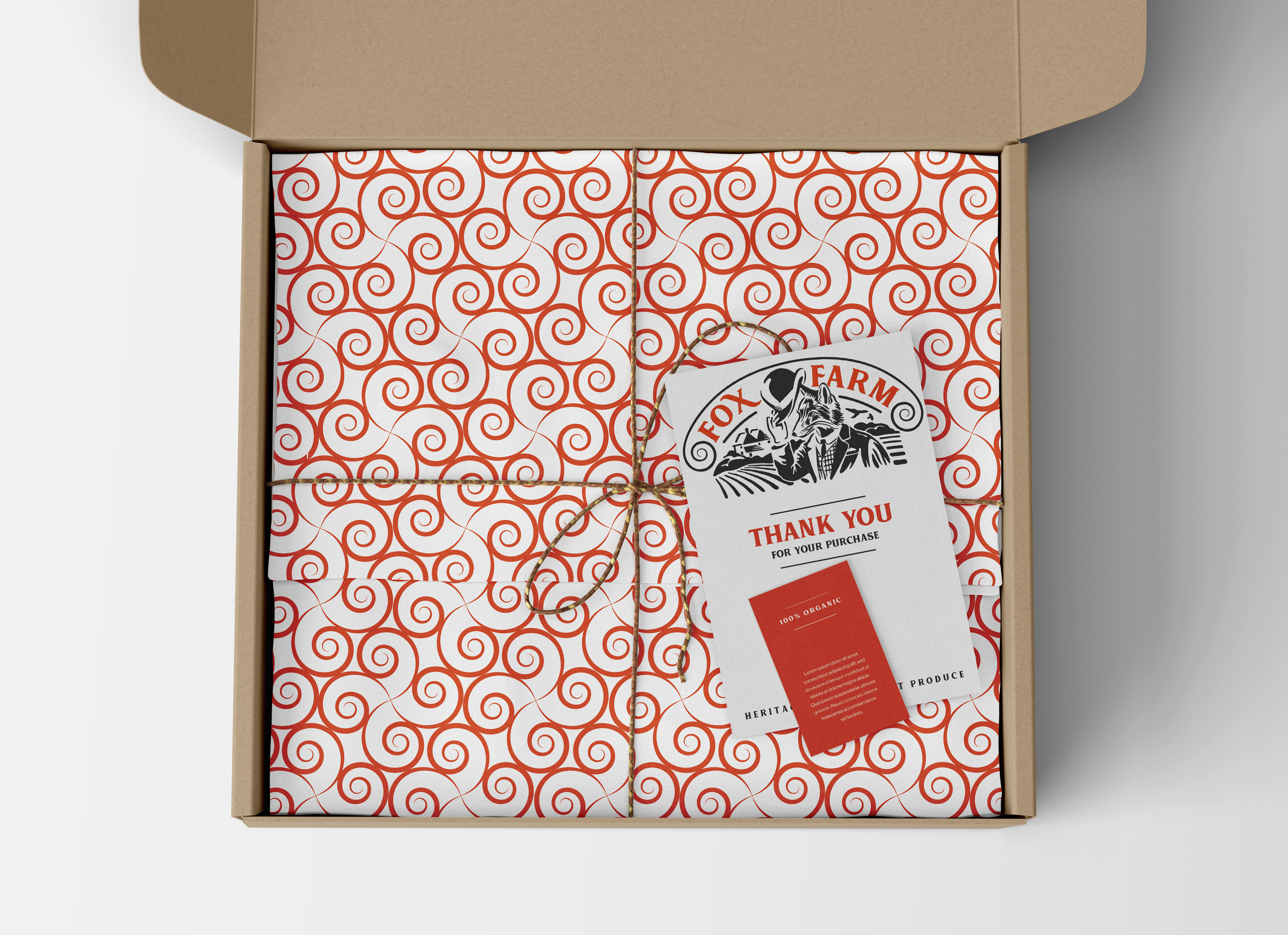
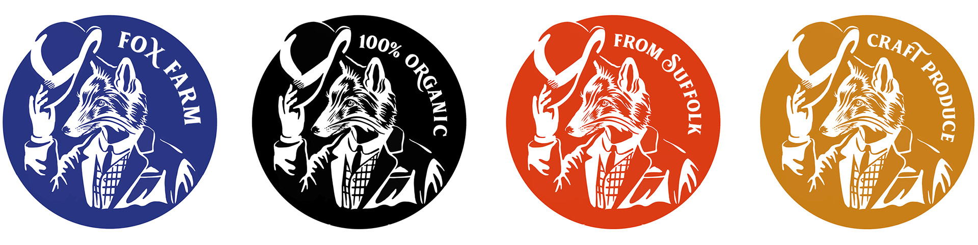
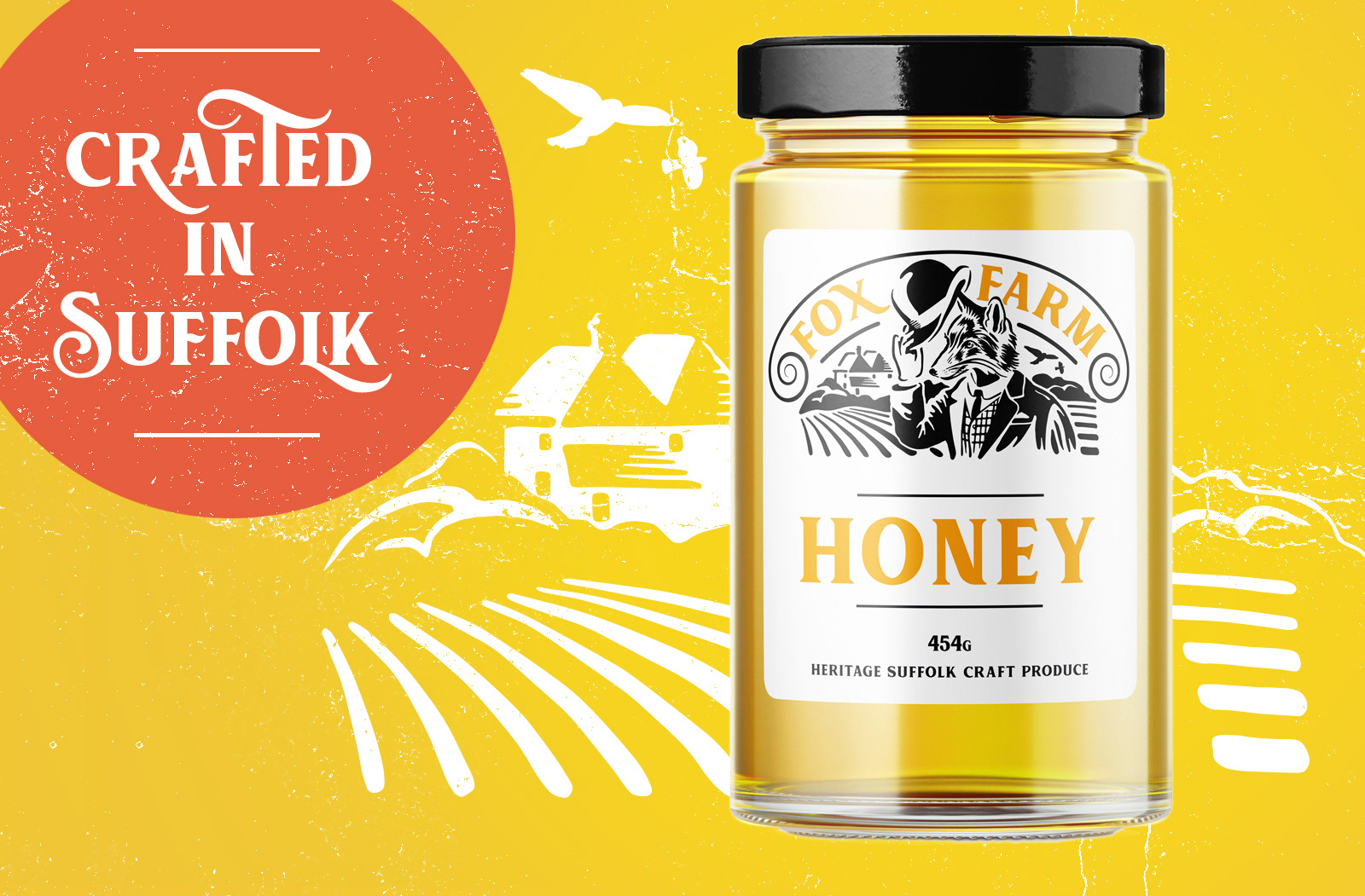
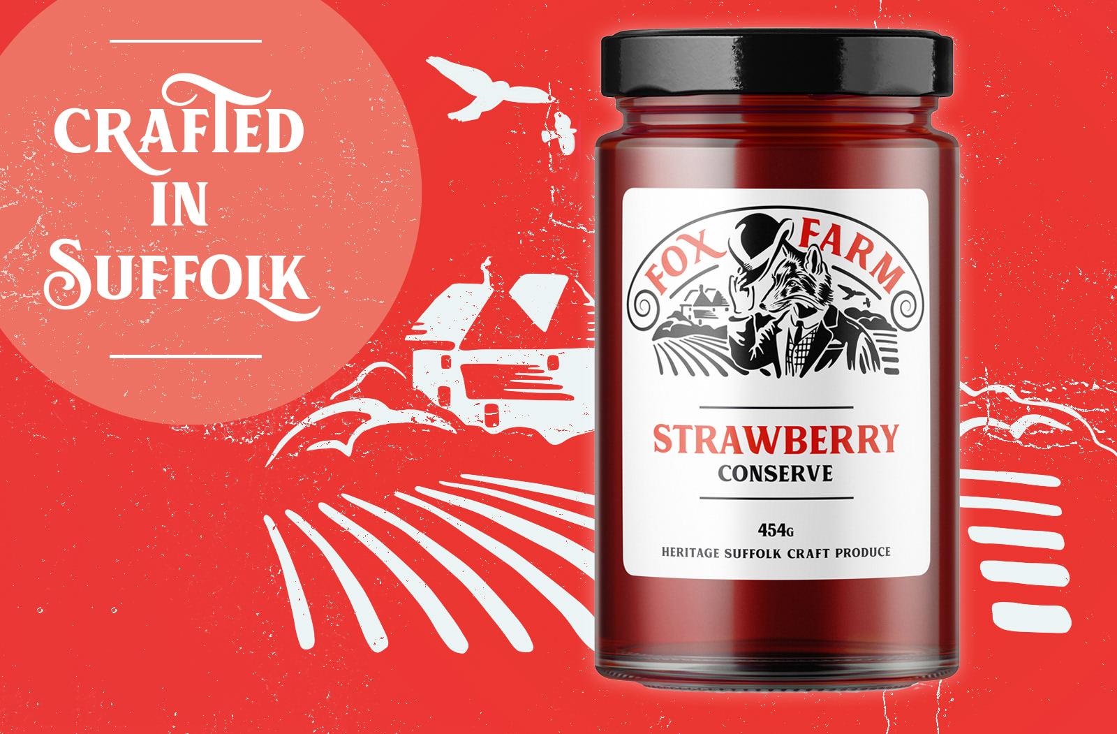
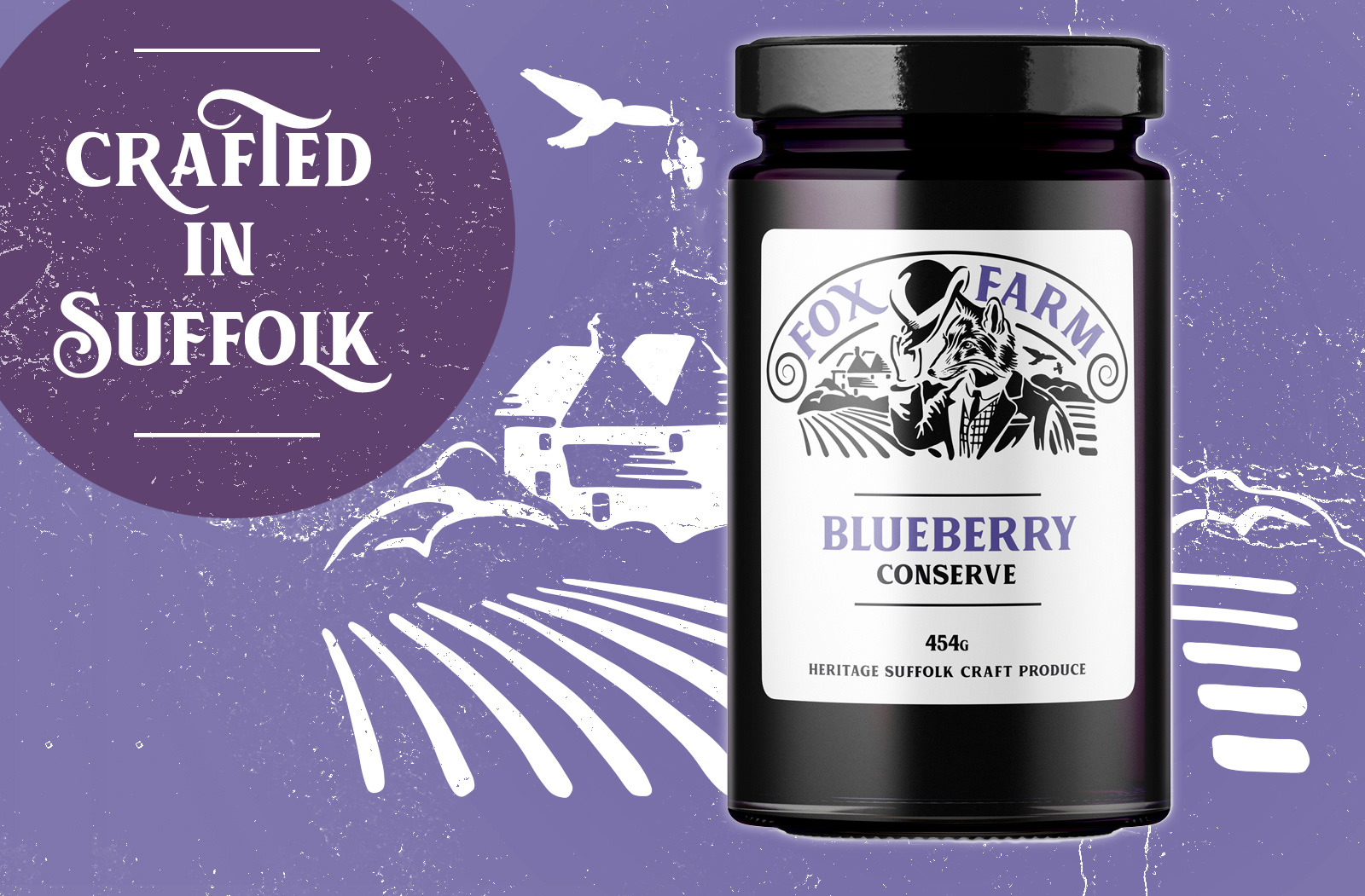
Packaging: Employing a restrained colour palette using only one colour to define the product with a black logo on white ground making a coherent and consistent brand identity. This unique style works across the range.


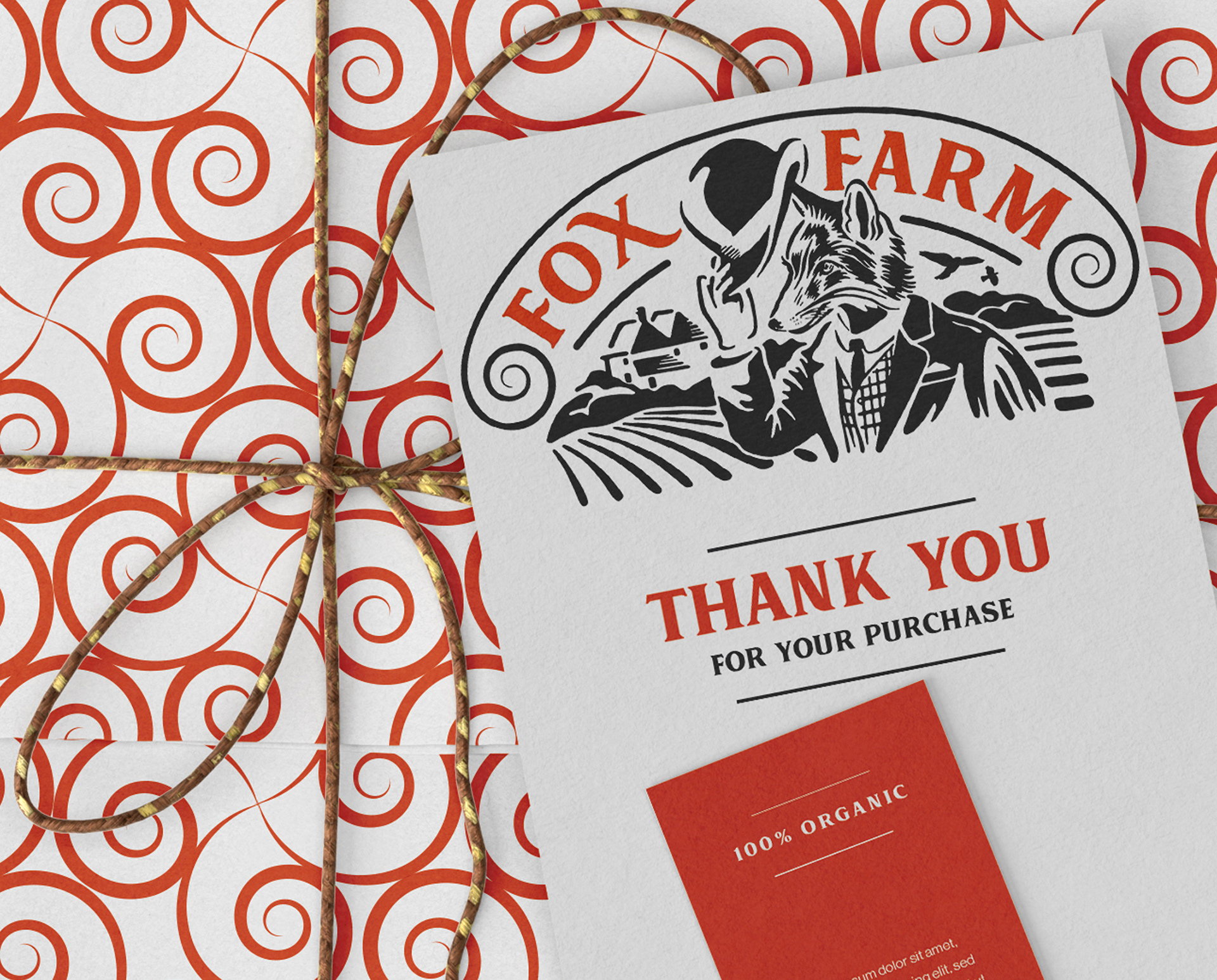
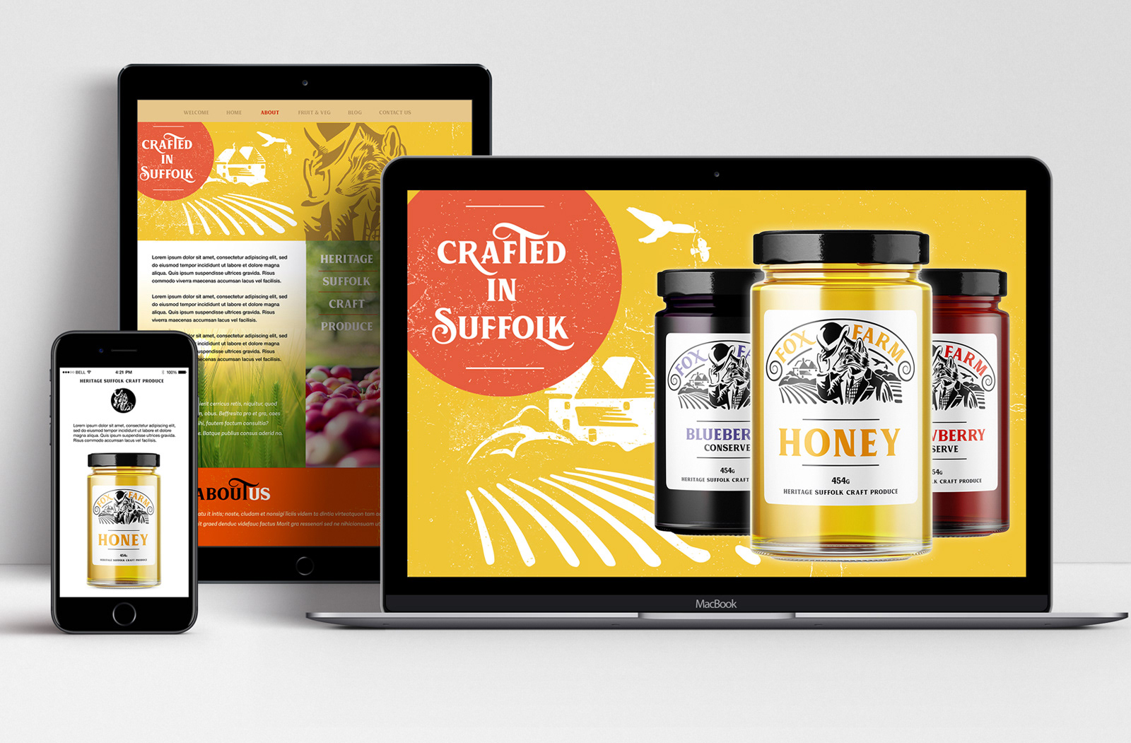
Digital Marketing: Creating a campaign of visual storytelling using illustration to connect the brand with their heritage.
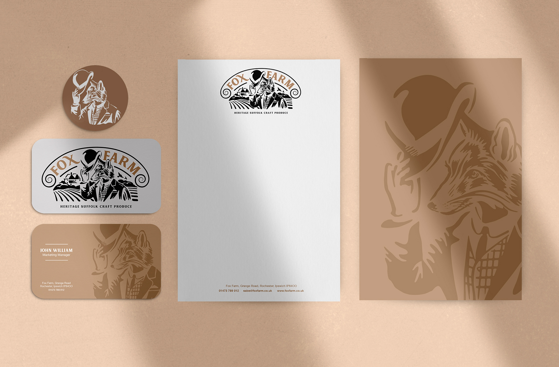
Stationary range: Using traditional earthy brown colour and layout featuring Mr Farmer Fox.